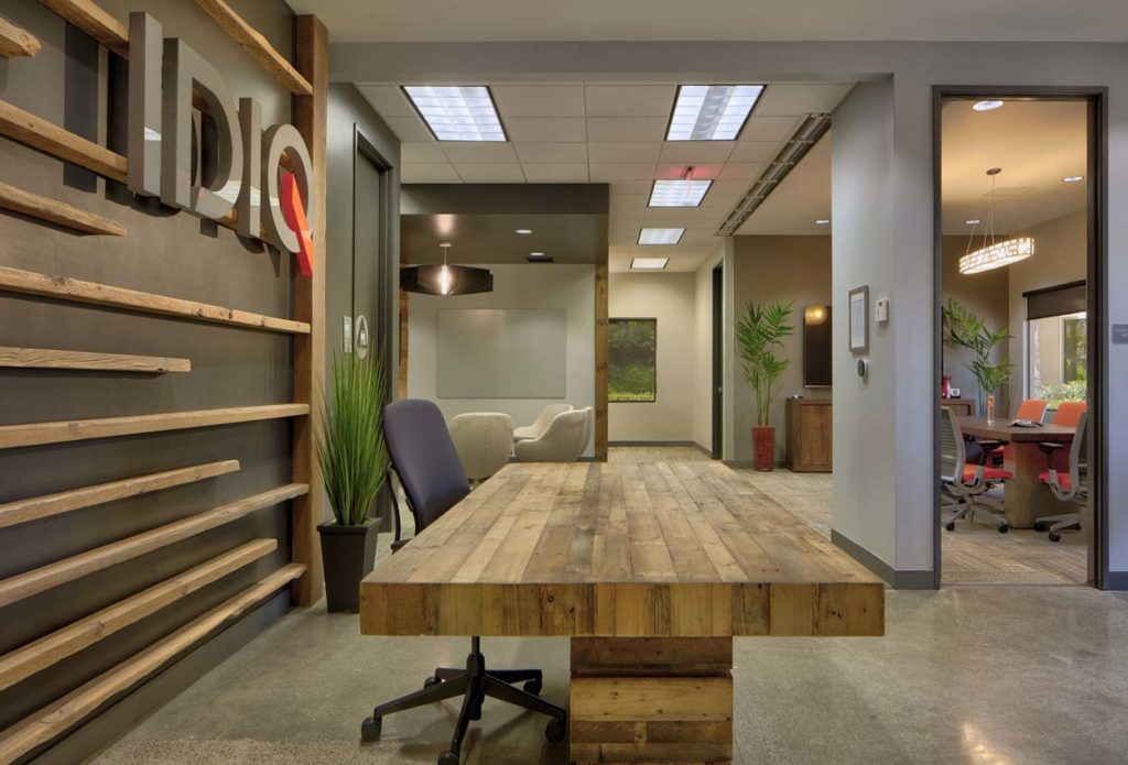
Branding your office requires so much more than splashing your logo colors on walls and furniture.
- You must be intentional with your choices.
- Thoughtful with your material selections
- Creative with your application
Here are my top tips that anyone can use:
1. When using color, pick small but ‘stand-out’ ways to incorporate it into your design.
(see the orange in this logo? It’s just one small part of the entire design, and is repeated on the conference chairs seats.) Painting an entire wall this color or making the whole logo orange would have diluted the impact.
2. Use materials that showcase your style and focus on the environment.
(This client was ‘green’ and eco-conscious so we used many local artisans and resources as well as natural elements to balance their ‘techy’ vibe.)
3. If you say your office is ‘open’ than it should look uncluttered, well organized, and spaces should be easily identifiable.
In order to create an open-yet-private office, we incorporated a sleek roll-up garage-style door that disappeared into the ceiling when it wasn’t needed.
When in use, the roll-up door is acoustical (and ‘green’), meaning it blocks sound almost 90% better than a typical glass door

Tamara Romeo is the Founder and CEO of San Diego Office Design and is the brand-savvy Design Boss that has led her design team with over 3 million square feet of improvements in San Diego and beyond. Learn more at www.wordpress-468545-1525225.cloudwaysapps.com

